PAINTING
- 31200209
- Jan 7, 2024
- 1 min read
Updated: Jan 25, 2024
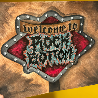
Following on from my initial sketches using a calligraphic writing style, I was inspired by S Mark Gubb's use of this death metal font which is scratchy, spiky and almost scary. I found some fonts I liked via DaFont and tried to re-create them to make a file that would cut out easily, should I end up using the laser machine to fabricate my sign or even cutting by hand.
I then began sketching the sign using this font and used Gouache paint to lay down some colour. I was trying to get this vision and idea in my head to come to life. However I found that my painting was too graphic, as I had imagined it to look more realistic. Once again I was being held back by graphic design style and background stopping me from creating freely.

I'm glad I painted this piece, as it confirmed for me that this work will be a 3D sign. I felt like it needed to come off the page and be a real, tangible, functional sign with lighting and layers. There were elements of the design I did like so I decided to vector the design. This way it could be cut on the laser and vinyl cutter and allow me to experiment with scale, colour and materials.


Comments