- 31200209
- Jan 7, 2024
Updated: Feb 2, 2024
'The expression of one's meaning by using language that normally signifies the opposite, typically for humorous or emphatic effect.'
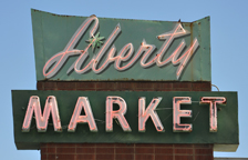
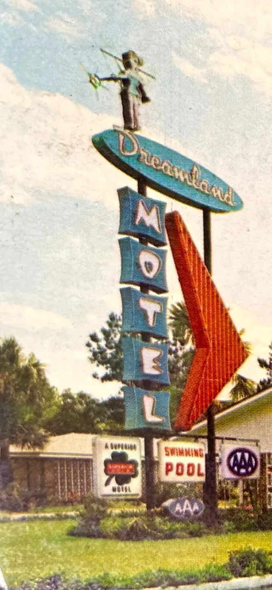
My piece does exactly this. Using the words 'Rock Bottom' that usually signifies the worst time of someone's life or worst state of mind, it should be a sad, dark, gloomy piece. Instead it is bright and lit up like a shop sign inviting you in, asking you to 'stay a while' which has connotations of a good time. This irony should spark interest in the viewer.

Examples of signs with ironic messaging.

This driver has clearly NOT driven carefully.

Colourful Colorado is in fact, very beige and bleak.
When scrolling through instagram, I saw this reel that shows a door with a sign on it saying -
THIS IS OUR HAPPY PLACE - only for a hand to remove it to reveal a hole punched in the door behind.
This is sad of course, but funny due to the clear and blatant IRONY of the sign.
This made me think about the aspirational signs you see in people's houses, for example the famous 'Live Laugh Love' that has now being synonymous with 'HUN' culture (outdated, cheesy, embarassing)

This 'Live Laugh Love' t shirt is ironic. The colour pallette of red and black, with the death metal font, is the opposite of the 'Live Laugh Love' aesthetic, with death metal culture being related to violence, hard rock and horror.


