top of page
BLOG

EMILY MCCANN BLOG

31200209

Updated: Jan 29, 2024

Olivia Steele in an American artist who works with signage, specialising in Neon installations, road signs and marquee signs. She has done installations in retail spaces, weddings, bars, even at the iconic Burning Man festival. This artist is the perfect inspiration for my current project.

She uses text and light to create beautiful, thoughtful pieces. Her work can sometimes be really personal, but presented in such an attention-seeking fashion like neon, her messages hit harder than the standard signs we are used to seeing.
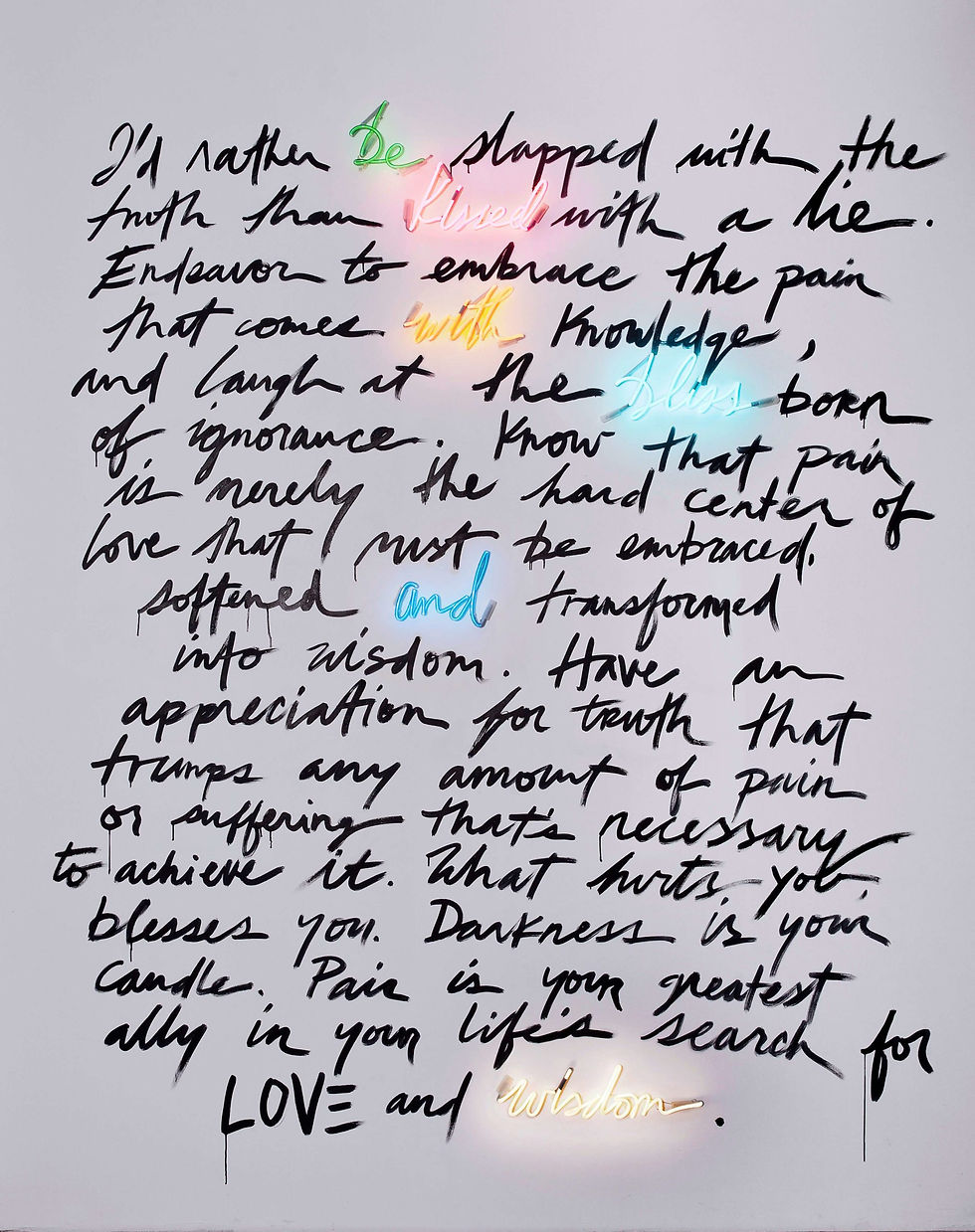


Olivia Steele, Neon works

Olivia's neon work is beautiful and personal. I particularly like the use of just a few neon words within the scrawled diary entry. It feels really intimate and special.


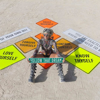
Olivia Steele, Road signs

These signs are eye catching and thought provoking. Our eye is trained to look out for road signs as a safety precaution, however these pieces replace your standard text with thoughtful quotes. I can only imagine how I would feel if I spotted one of these signs driving down the road -

'You are exactly where you need to be'

- could be so empowering and inspiring if you were in a bad state of mind.


Olivia Steele, Marquee series

These marquee signs are often installed within already existing signage such as cinemas and theatres. Where you would expect a show announcement or screening times you are seeing deeply personal messages that feel intimate, almost like we shouldn't be seeing them.


This artist has inspired me so much! I am so drawn to the simplicity yet nuance of using ordinary signage to traditions to break rules and boundaries within this space. Her work is clearly made to a beautifully high standard, with a high budget. I am so drawn to these types of signs but I am limited due to cost barriers, especially with neon which is expensive and requires highly skilled training.


3 views
31200209

Updated: Jan 25, 2024

Following on from my initial sketches using a calligraphic writing style, I was inspired by S Mark Gubb's use of this death metal font which is scratchy, spiky and almost scary. I found some fonts I liked via DaFont and tried to re-create them to make a file that would cut out easily, should I end up using the laser machine to fabricate my sign or even cutting by hand.

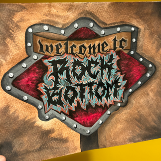
I then began sketching the sign using this font and used Gouache paint to lay down some colour. I was trying to get this vision and idea in my head to come to life. However I found that my painting was too graphic, as I had imagined it to look more realistic. Once again I was being held back by graphic design style and background stopping me from creating freely.


I'm glad I painted this piece, as it confirmed for me that this work will be a 3D sign. I felt like it needed to come off the page and be a real, tangible, functional sign with lighting and layers. There were elements of the design I did like so I decided to vector the design. This way it could be cut on the laser and vinyl cutter and allow me to experiment with scale, colour and materials.

1 view
31200209

Updated: Jan 25, 2024

I began developing the design of my signage. I wanted to use the iconic diamond shape of the Las Vegas sign.

I originally wanted the sign to be rusty, old, broken, and uninviting using a dark colour pallette.

I sketched this out in my own signature calligraphy style, mirroring the Mid-Century Modern feel of the Las Vegas sign, with a more contemporary Americana feel.


Talking to Tom, my tutor, he mentioned 2 artists that would be good to research for this project.

I converted my sketch into a digital file by tracing on my iPad, so I could duplicate, move and re-colour elements easily.


I was weighing up two different ideas.

  1. A painting of said sign, in situe in a dark dreary dessert type of landscape

  2. An actual sign, fabricated and built up with lighting.

I liked the idea of layers on the sign so it would look 3D even if it was a flat painting. I kept going back to my original sketch wondering if it was too Happy as I did want it to be dark and gloomy representing true rock bottom as an emotion.

2 views
bottom of page